OVERVIEW
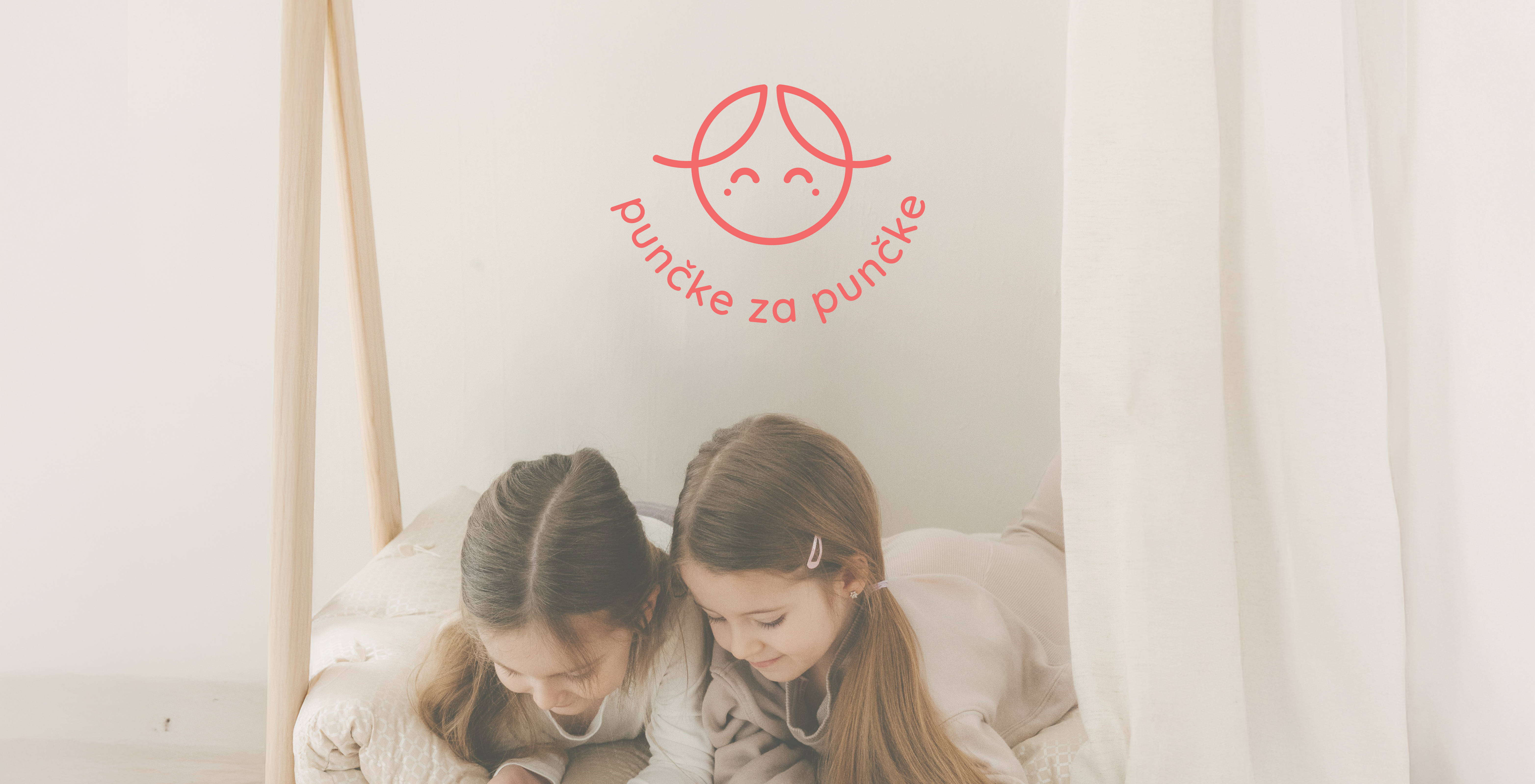
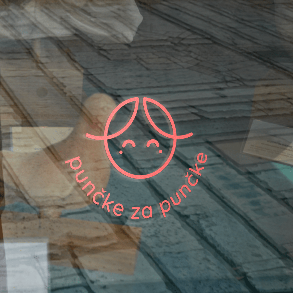
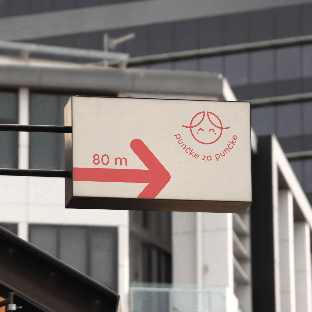
Punčke za punčke is an online store that sells dolls and other similar toys. The client wanted a logo that featured a doll’s face, leaving the rest of the creative direction open. This gave me the freedom to create a fun and approachable identity that would resonate with both kids and parents.
Client: Punčke za punčke
Year: 2023
Role: Graphic designer
DESIGN GOALS
Incorporate a Doll Face
Create a logo featuring a doll’s face, as per the client’s request.
Balance Fun and Professionalism
Design an identity that is bright and playful to attract children while maintaining a sleek, modern style that appeals to parents.
Prioritize Legibility and Simplicity
Create a design that remains easily recognizable and readable, especially at small sizes or on digital platforms.
Convey Warmth
Create a design that is warm and approachable.
OUTCOME
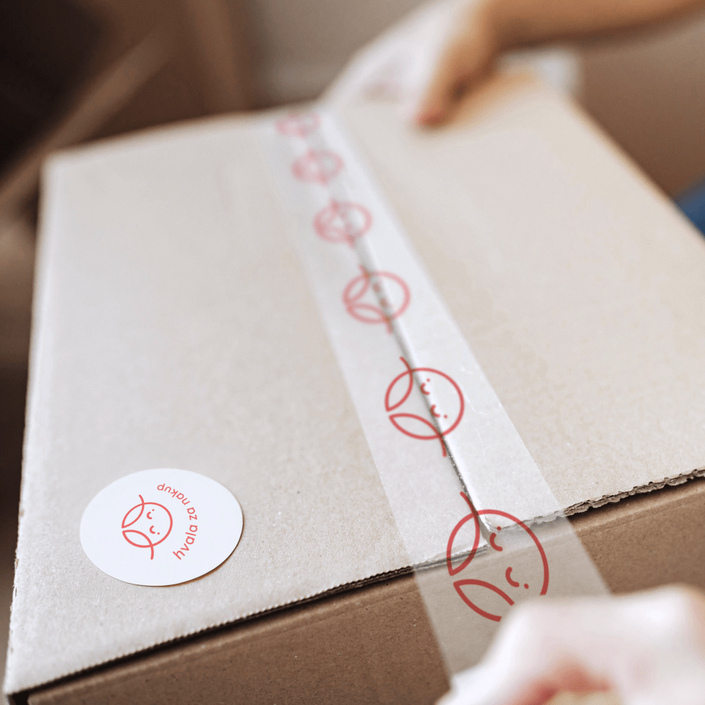
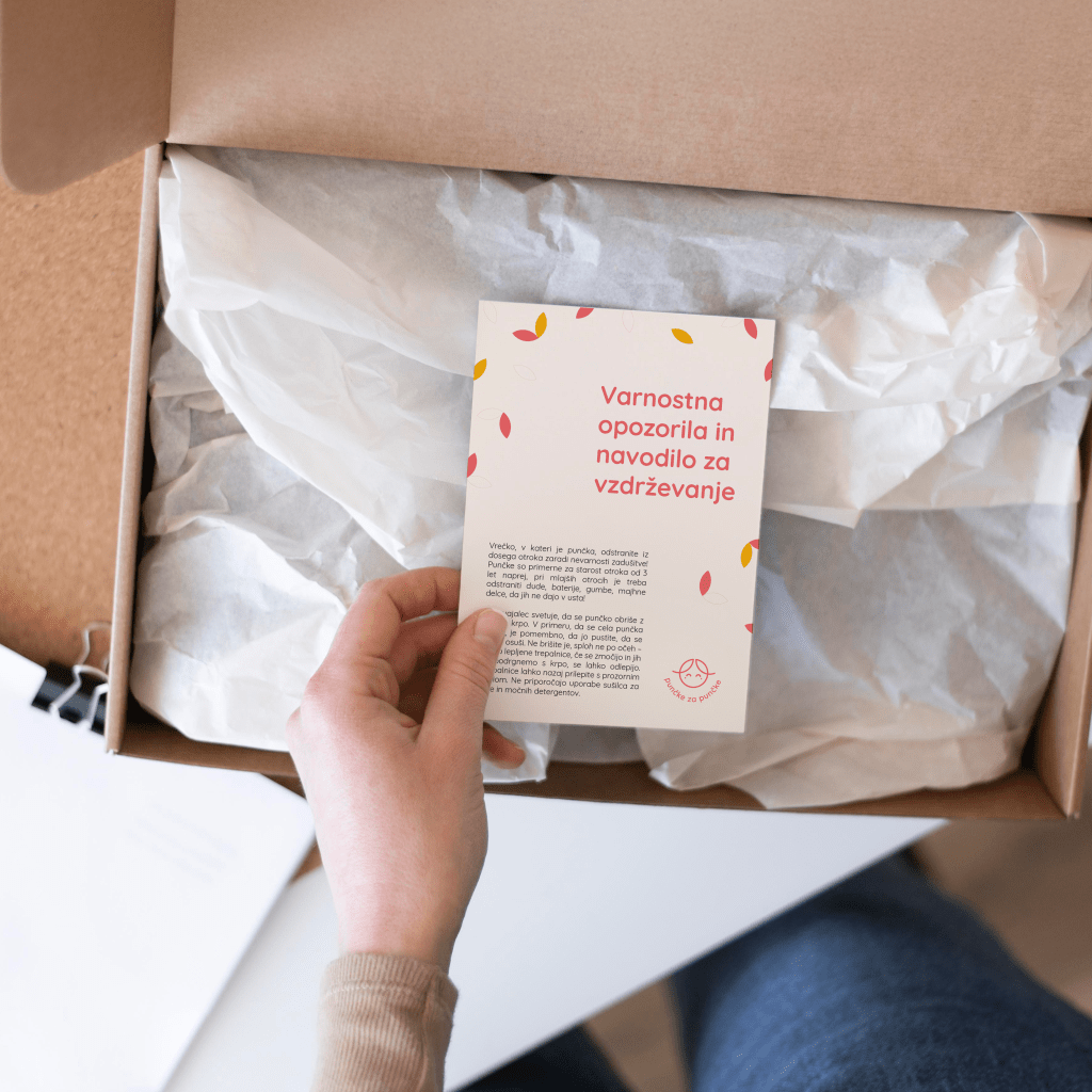
The final design features a minimalist logo with a simple doll face with the clean and friendly Quicksand font. The color palette combines a soft coral and beige, conveying feelings of warmth, approachability, and playfulness. The logo and typography work well in various applications, ensuring versatility.
I’m especially proud of how the final design turned out, it captures the joyful and playful spirit of the brand while still feeling polished and versatile. Hearing positive feedback from the client and seeing how the design resonates with their audience was incredibly fulfilling.

© Ana Vičič 2025
