OVERVIEW
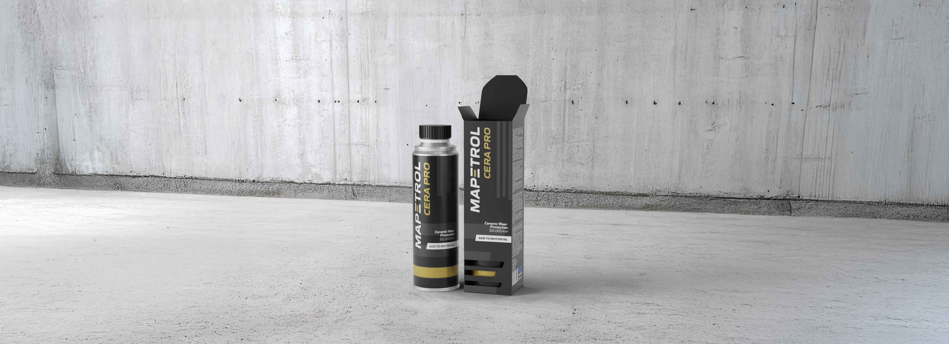
The company launched a new product, an innovative ceramic engine oil additive, which required unique packaging to reflect its premium status. This product, which is a part of the Mapetrol range, is the first to include a box, setting it apart from others. As a premium product, the packaging had to stand out while adhering to the established brand guidelines.
Client: Mapetrol
Year: 2024
Role: Packaging designer
DESIGN GOALS
Premium Look
Create a design that conveys the product’s high-quality and premium nature.
Brand Alignment
Ensure the design adheres to Mapetrol’s branding guidelines, using consistent colors, typography, and logo placement.
Unique Features
Incorporate unique design elements to distinguish the product from competitors and other items in the Mapetrol range.
OUTCOME
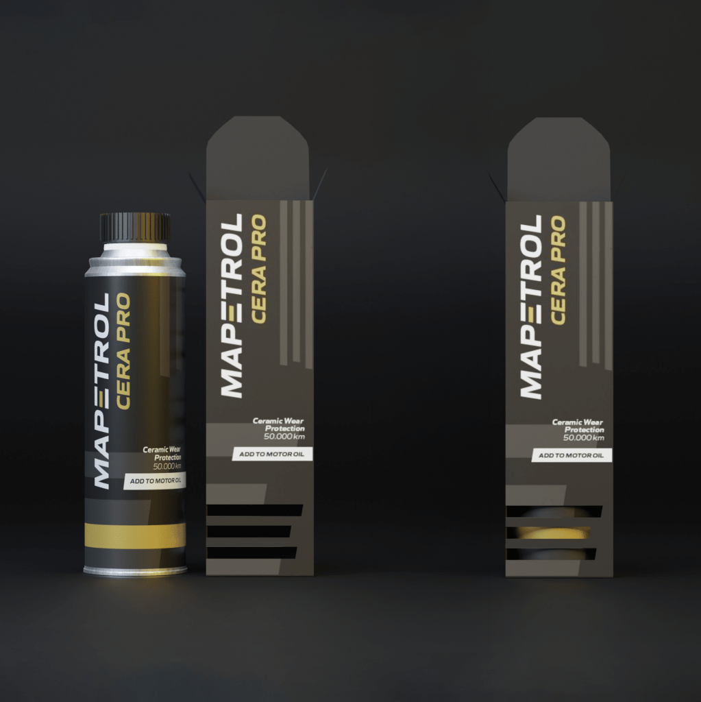
The final design is sleek and professional and that aligns with the brand’s identity while highlighting the product’s premium status. The packaging features a black and gold color scheme, which gives the feeling of luxury. A custom-designed box with cutouts in the shape of the Mapetrol logo reveals the can’s gold accents beneath, creating a visually dynamic effect.
This project definitely pushed me out of my comfort zone. Designing the cutouts in the box was particularly difficult, as it required precise planning to ensure the shapes were both functional and visually aligned with the brand’s aesthetic. I had to consider how the cutouts would interact with the can beneath, ensuring the colors enhanced the overall look without compromising the packaging’s structural integrity. Despite these challenges, it was really rewarding to see how this detail elevated the design, making more memorable.
© Ana Vičič 2025
