OVERVIEW
A računovodstvo is a website created for an accounting firm focused on providing clients with easy access to essential information and services. The design is clean and professional, making it simple for users to navigate and quickly find what they need. Using a minimalistic approach, the website presents services clearly, helping clients connect with the team easily.
Client: A Računovodstvo
Year: 2025
Role: UI/UX designer
DESIGN GOALS
Professional Look
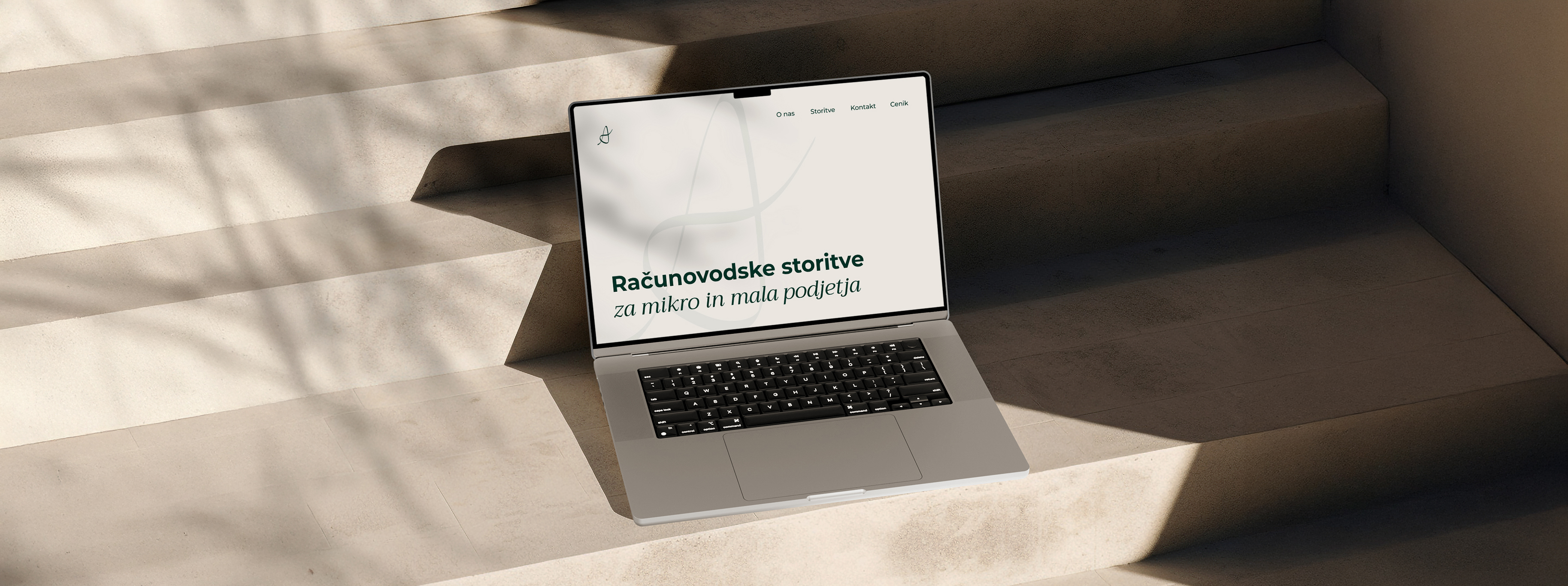
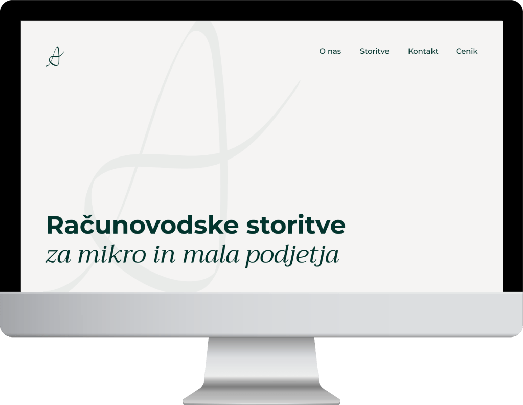
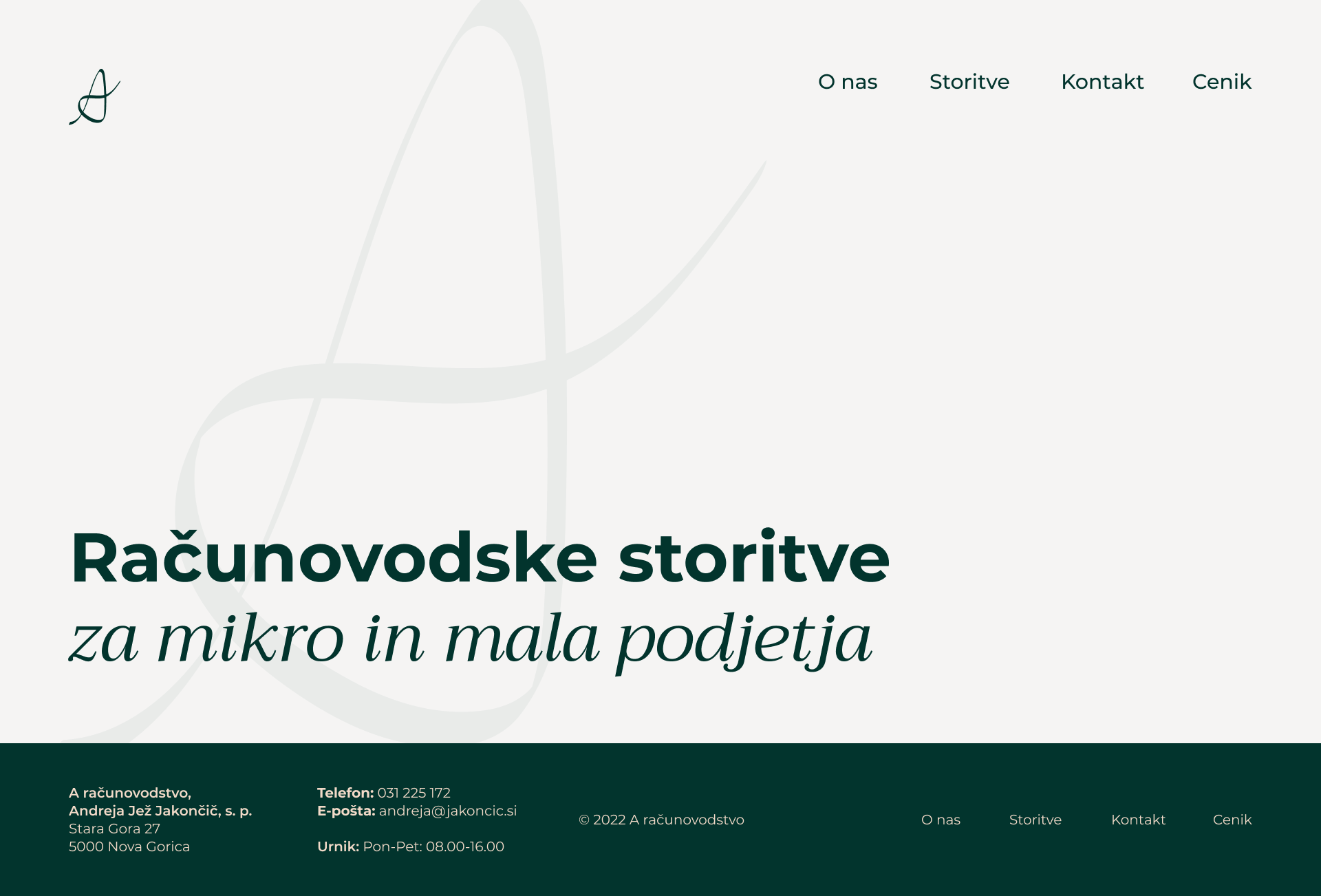
Create a clean, professional aesthetic that reflects the firm’s credibility and aligns with the existing brand identity.
User-Friendliness
Ensure navigation is easy so users can quickly find the necessary information without any trouble.
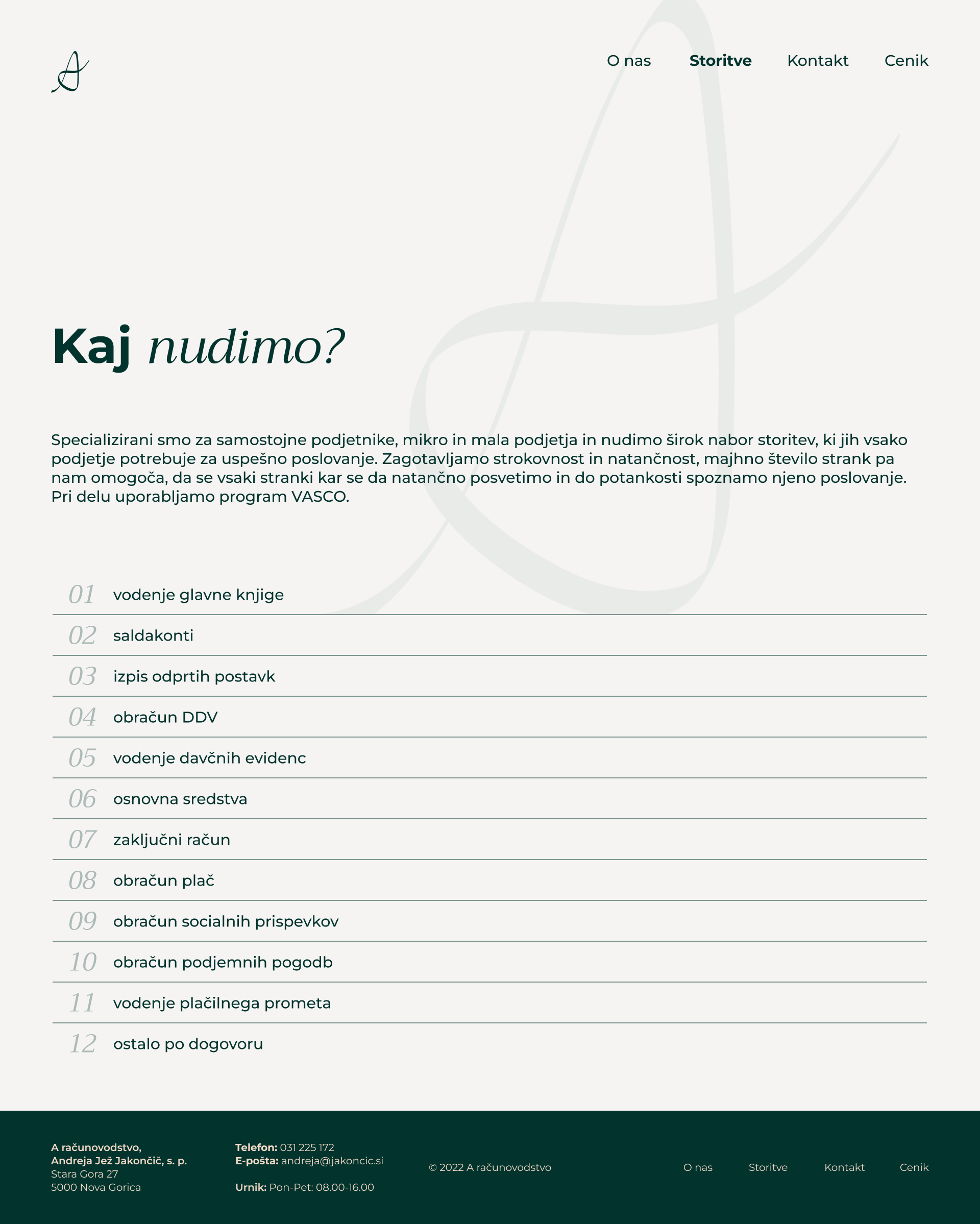
Presentation of Services
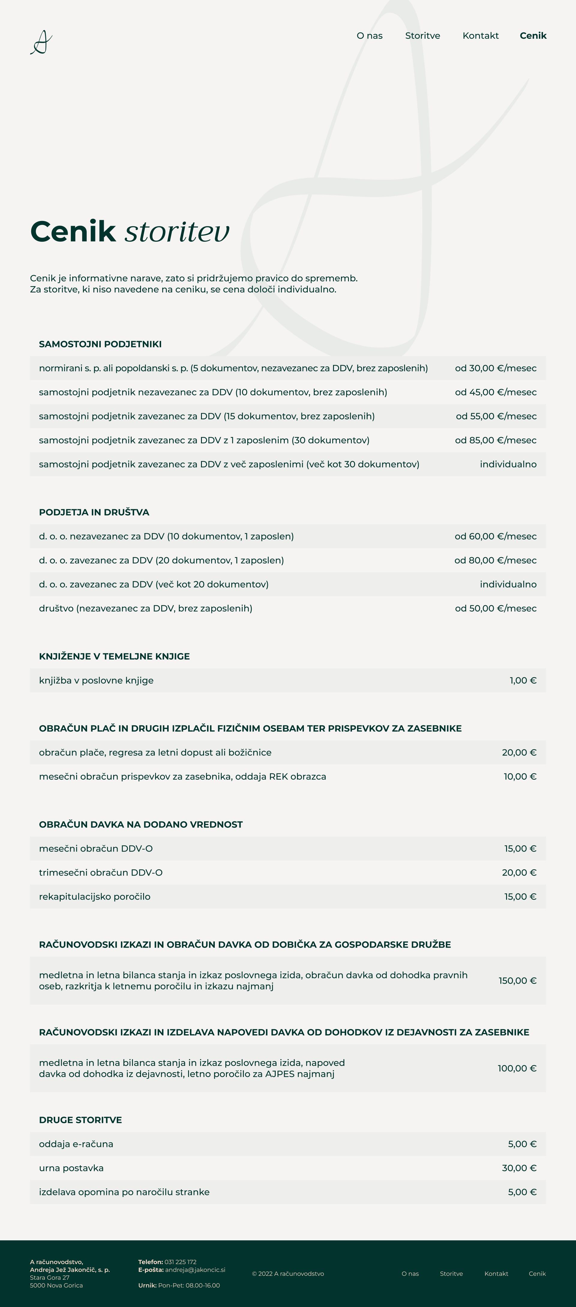
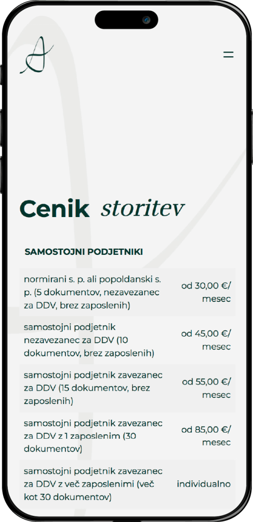
Use a minimalistic design to present the services the firm offers in a straightforward way, avoiding clutter and focusing on clarity.
Easy to Find Contact Options
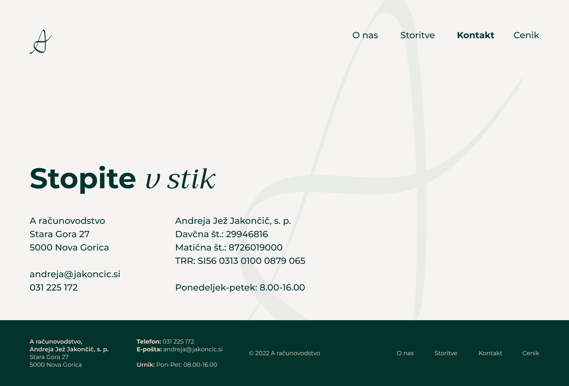
Make it easy for clients to connect by ensuring that contact information is easily accessible.
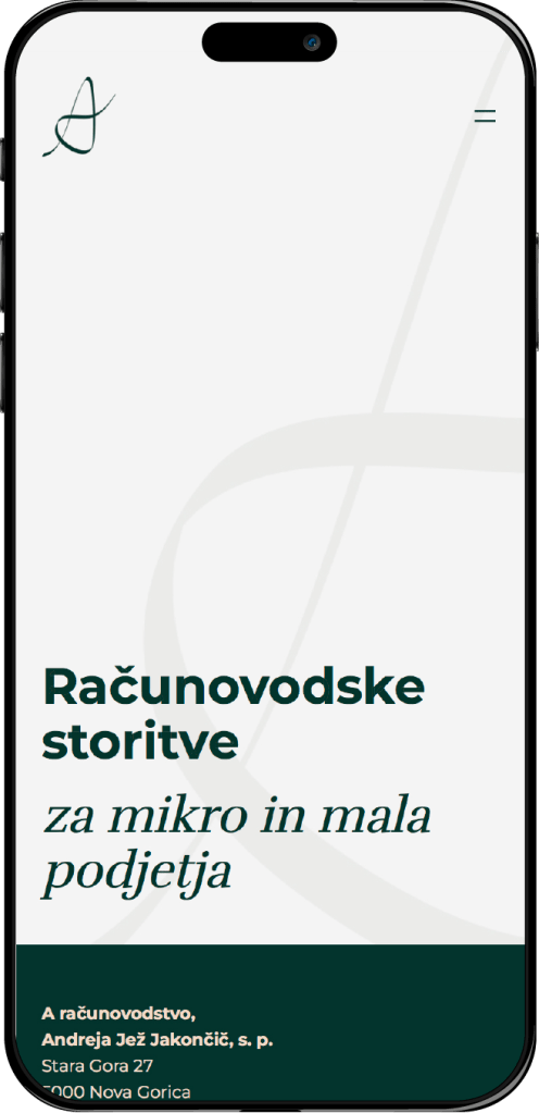
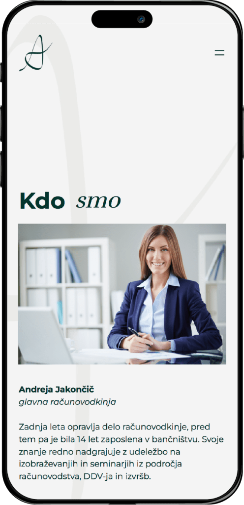
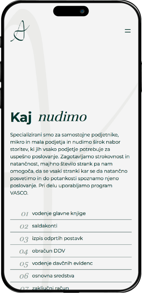
Responsive Design
Design the website to adapt smoothly to any screen size, ensuring a consistent and user-friendly experience on desktops, tablets, and mobile phones.
PROCESS
Research and inspiration
The process started with researching other accounting firms and financial websites to understand industry standards, paying close attention to color schemes, layouts, and content organization, and focusing on ways to keep the design clean and easy to navigate. Additional inspiration was drawn from well-designed websites and popular business sites outside the industry to broaden creative ideas. This research provided a solid foundation for crafting a design that feels both user-friendly and visually appealing.
Information Architecture
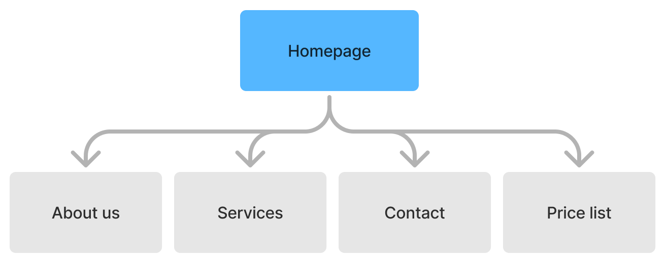
Wireframing
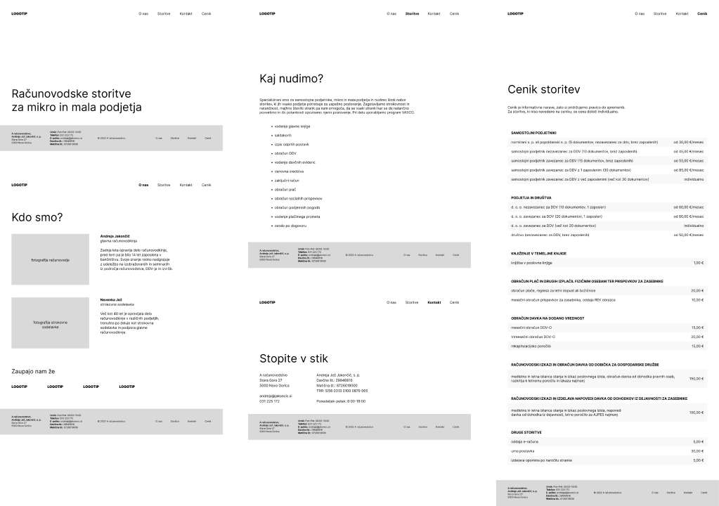
In the wireframing phase, the goal was to create a straightforward and organized layout that would make it easy for users to navigate the site. Each wireframe was designed to be as simple as possible, aiming to give users a clear path to find information. These initial wireframes laid out the basic visual and structural framework for a professional, user-friendly website.
UI Design
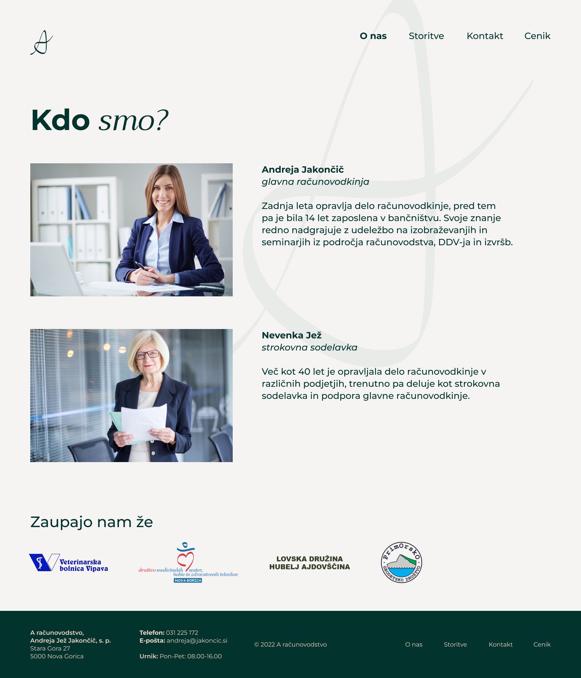
The UI design phase was focused on bringing the wireframes to life with a clean and polished look. The firm already had a brand identity that needed to be incorporated into the design. The goal was to create something clean and minimalistic but still warm and approachable, not overly sterile. Since the firm is led by two women, the design aimed to stand out from typical corporate sites and bring a touch of feminine energy, adding a unique and welcoming feel.
Prototyping & testing
After finishing the UI design, an interactive prototype was created in Figma to bring the user experience to life. The prototype was optimized for both desktop and mobile, ensuring it looked and functioned well across different devices.
Once the prototype was ready, user testing was conducted to evaluate its effectiveness. The testing was conducted with ten potential clients that matched the target audience. Users were asked to find specific information on the site, like a phone number, e-mail, business hours, price of a certain service, and existing clients. The feedback identified certain areas of improvement, such as rearranging the menu order, adjusting font sizes in the footer, and changing the placement of existing clients. The adjustments were implemented to enhance the overall usability and clarity of the site.
OUTCOME
The final design achieved the main design goals, resulting in a professional website that is easy to use. Feedback from users showed that they could easily find the information they needed, and the adjustments made based on their input improved overall clarity and usability.
This project taught me a lot about balancing aesthetics with usability. Creating a design that felt both professional and approachable was challenging, especially in an industry that’s often very formal. Adding a subtle feminine touch to reflect the firm’s leadership made the site feel uniquely welcoming, which was rewarding to see.
© Ana Vičič 2025
